Hello Data Nerds! We are currently in the middle of summer and in Greece we are boiling in 38 degrees Celsius! But why not publish another Cozy Data Pub article?
Intro
Following our previous article – which you can find here – we are going to continue our overview in Power BI. Next stop is Power BI Desktop which you can download for free. (click here if interested.)
What is Power BI Desktop?
Power BI Desktop is the free offering of Power BI and it gives you the ability to create reports directly in your laptop. You can connect to various data sources, prepare data, create data models and visualizations. Unfortunately by having only the free version you cannot publish and share the reports to other users (and no it is not considered best practice to distribute the files that you create in Power BI Desktop). Usually Power BI Desktop is used to develop reports that later will be published to the Power BI Service.
Power BI files are saved with the extension .pbix which contain all the transformations, modelling and visualizations that were created.
So enough with the overview, let’s go and get a glimpse of Power BI interface!
Navigating through Power BI Desktop
After you have downloaded and installed Power BI, you go ahead and open the application. You should be able to see something like the image below:
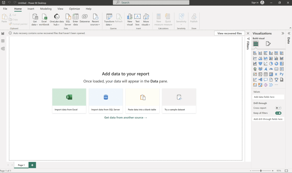
Just an empty canvas and endless possibilities. Where to begin someone will wonder?
Import Data
The first step is to import our data. We need a source for that. Let’s say that we have an excel file with 3 sheets:
- Ratings (includes an id column and a rating columns (1 ->5))
- Name (includes an id column and a Name Column)
- Age (includes an id column and a Birthdate column)
So actually Ratings is our fact table, and the two others are our Dimensions. Don’t worry if you do not understand this terms yet. We will cover this in a different article.
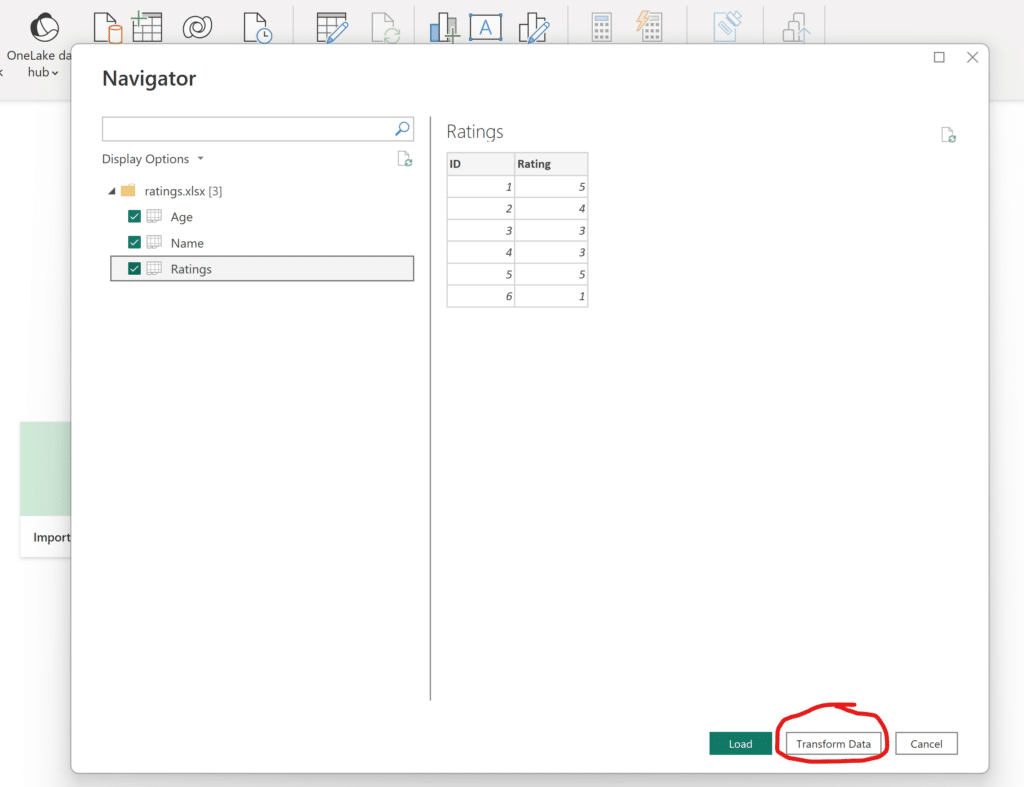
While in our canvas, we will press the button Get Data, that will enable us to import the different excel sheets to Power BI. Then choose the file that you want.

After selecting your file, you will have to choose the sheets that you want to load into Power BI. Be sure to select Transform Data so that you can be able to perform some additional transformation before visualizing the data.
Data Transformation
After hitting the Transform Data button the Power Query Editor opens. This is the area where you can do various transformations to the source data.
On the left side there is the area called Queries (no.1) where all your source data are loaded and on the right side there are all the transformations steps that are applied in sequence to your data source. (no.2). Moreover in the Ribbon (no. 3) you can find a lot of choices that have to do with different transformations, aggregations, data quality of the columns, diagnostics etc.
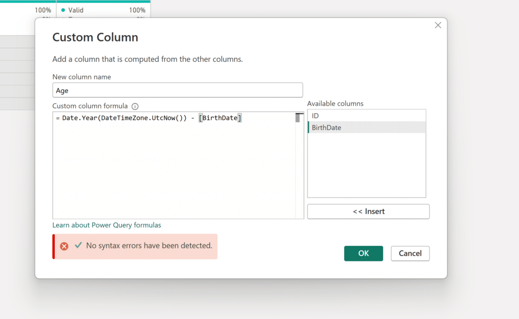
The only transformation that we are going to do, is to calculate the age of the users by taking the birth date and subtracting it from the current year.
We select Add Column -> Custom Column from the Ribbon and we go in and write our formula.
| Did you know? |
|---|
The calculation actually first calculates the current datetime in utc, and then we keep only the year and we subtract BirthDate from that. After that we have a new column named Age in our table.
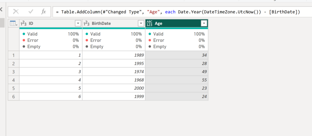
Remember to change the type of the column to whole number by clicking on the ABC123 indication on the Age column and converting it to Whole Number. As a rule of thumb, we should not forget to set the type of columns properly.
After that we are ready to load our data into Power BI, so that we can move on with the modelling and visualization part. Under Home in the Ribbon, we hit the Close & Apply button.
Modelling our data
After loading up our transformed data into Power BI, we have to set up the connections between our tables. Power BI auto traces relationships between tables, but most of the times we have to set them up ourselves.
On the far left we can see these 3 indications:
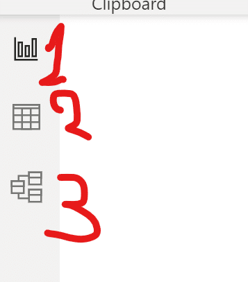
- The report view – there we can see all the visuals that we have created.
- The data view – there we can see what data our tables have.
- The model view – there we can see how the tables are connected.
We choose model view to see how the tables are connected.
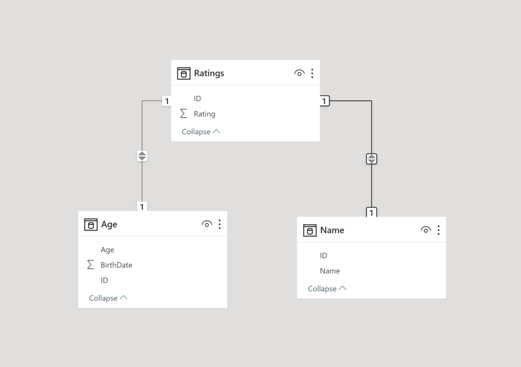
The arrows indicate the filtering directions among the tables and the numbers on either side of the tables indicates that there is a 1 to 1 relationship among the tables, i.e. that each ID corresponds to only one ID to the other table. There are a lot more to talk about on how the tables are connected, but this article covers only the basics.
Visualizing our Data
So far, we have done a basic transformation to our data and we connected them appropriately. Let’s say now that we want to create a table that will show the name of the user, their age and the rating that they gave. So actually, we need to combine data from all our tables. Rating from the Ratings table, Age from the Age table and Name from the Name table.
In the report view, from the Visualizations pane (located on the right) we select the visual Table. After that we drag the columns we want either directly in the report view or in the Columns area under the Visualizations section.
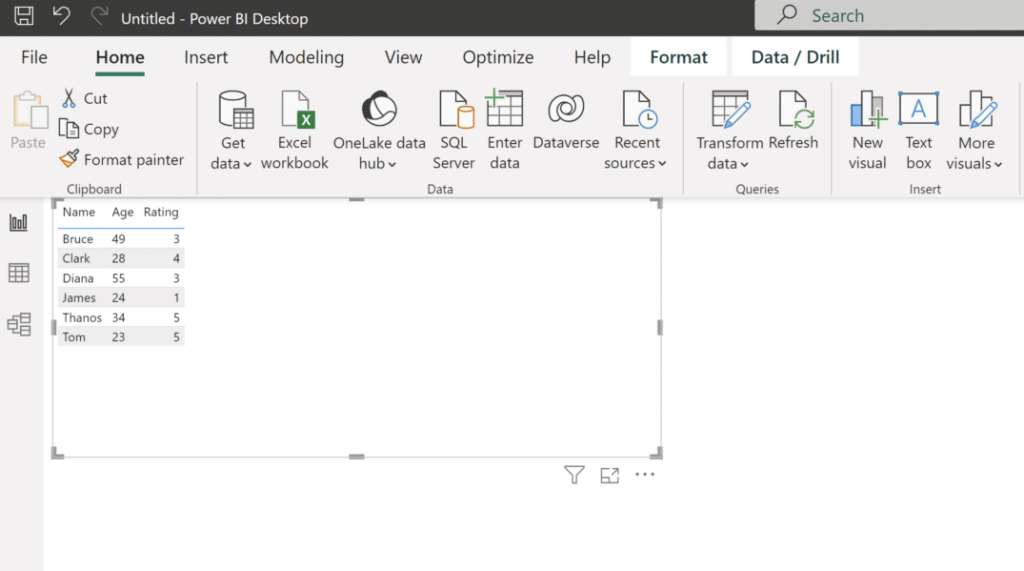
In some numeric columns Power BI by default inserts an aggregation, we can change that by clicking on the down arrow in the desired column under Columns in the Visualizations Pane.
So here we are! We have a table which combines data from 3 tables. Without the connections between the tables we couldn’t have done that. Additionally we have a new calculated column that gives us the age of the user.
So this is it. This is in a high level the route someone typically follows to Import -> Transform -> Visualize data in Power BI. Between these steps there are lot that can be done but these are the essential steps to analyze data in Power BI.
Until next time enjoy a cold beer under the summer sun (don’t stay too long and always apply a sunscreen).
Please don’t forget to subscribe, the more the better.
Cheerios!